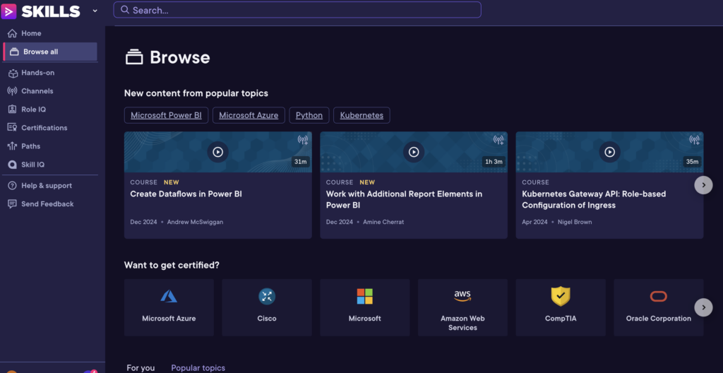
The Pluarsight design I find a bit overwhelming. It has similarity groups together; it has continuity. On this browse page, my eyes draw to the videos. Proximity groups subtexts, but it’s just too much. Theres too much information, to much text. It makes me feel anxious.

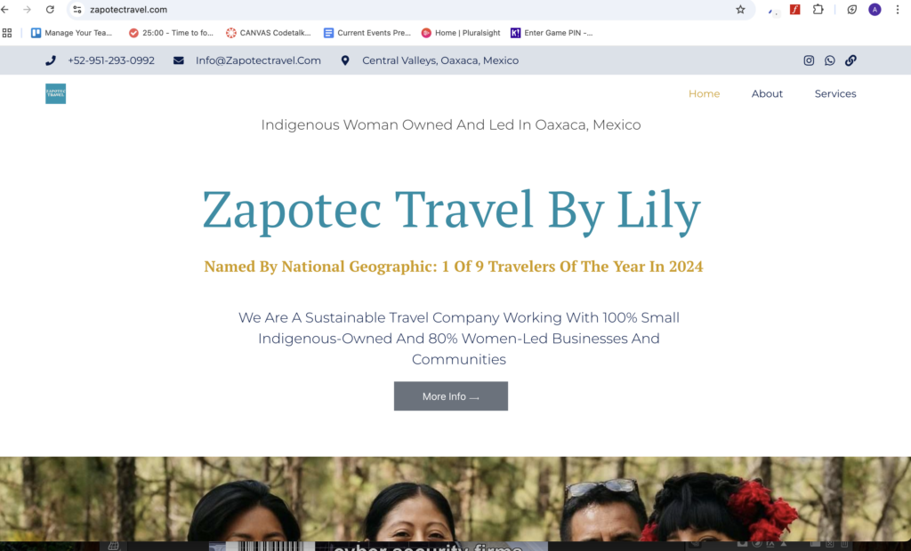
On the website Zapotec travel, I like the white background and images, but I think it has too many words. The image on the home page does give a sense of closure that encourages scrolling. It is symmetrical and has Common fate with the name of the compant in a different color. It’s a great start.

Do you notice any other graphic design principles applied in these designs?
Leave a Reply